Finsa finishes for a spark of life
The oak for the walls and furniture at Coca-Cola's headquarters in Madrid comes from our factories.
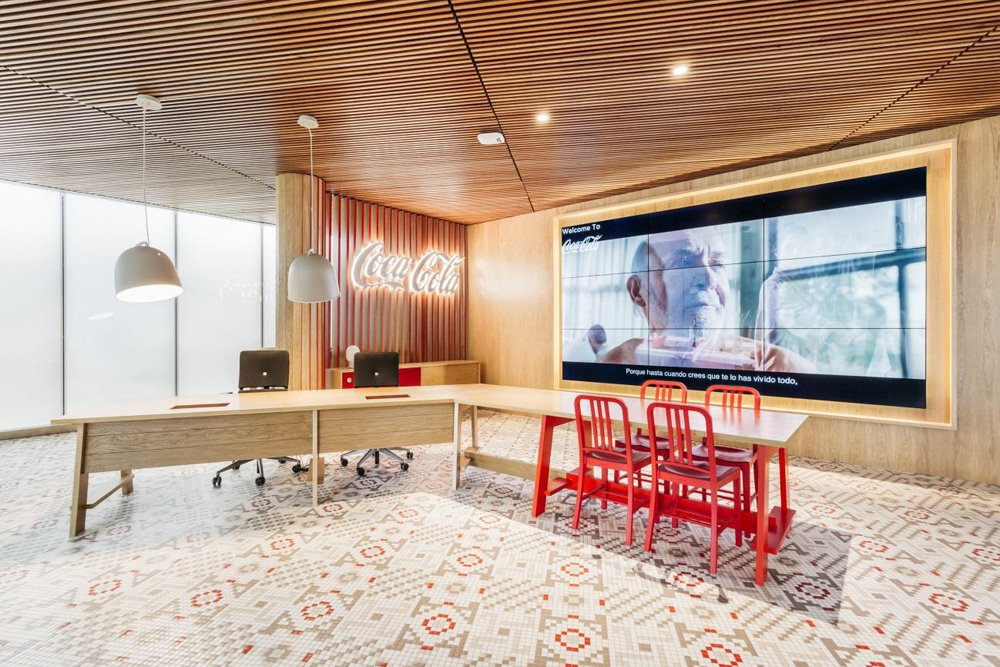
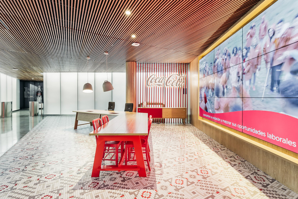
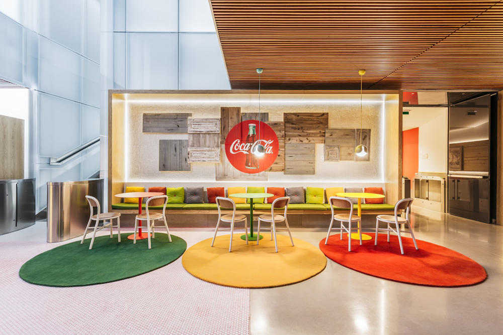
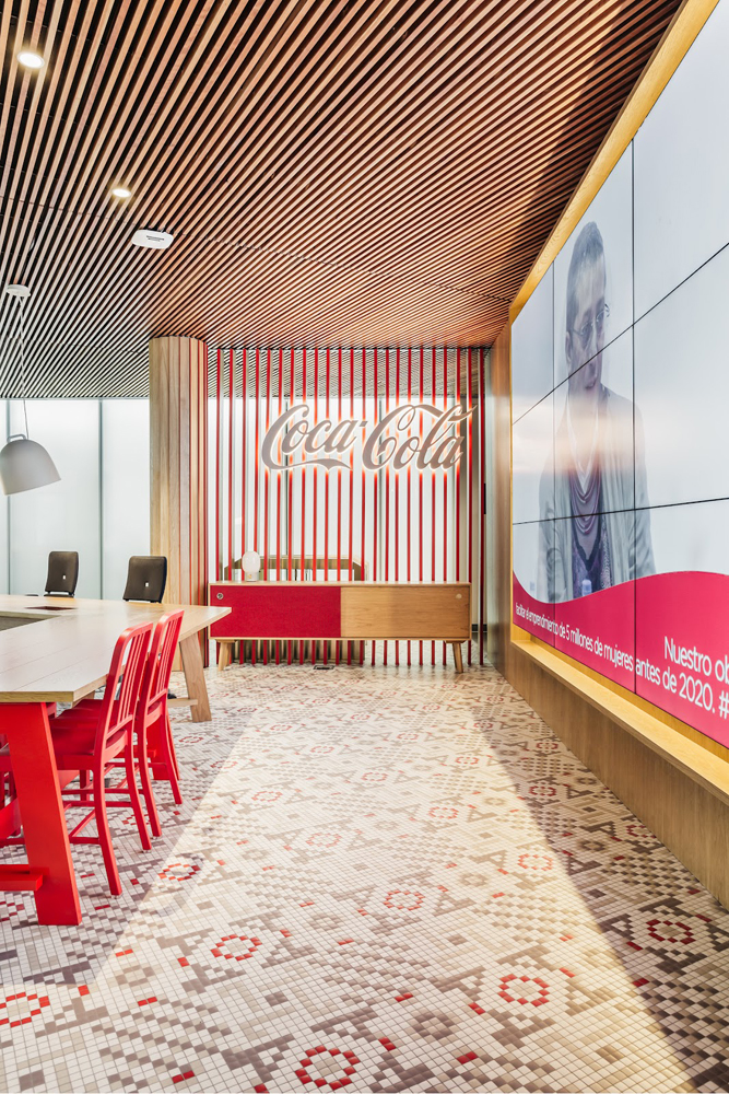
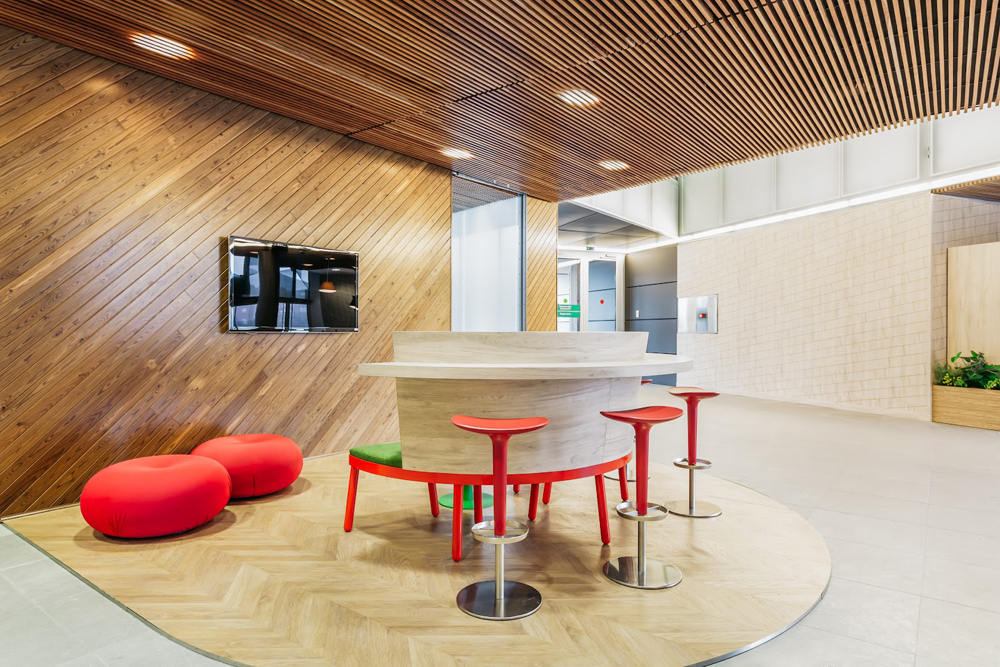
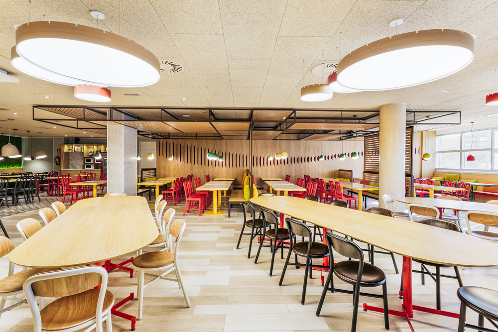
Who doesn't know Coca-Cola? Being commissioned to design the headquarters of a company with as much history and character as this, was a tremendous challenge for Stone Designs. They needed to rely on materials they trusted, such as Finsa products. Optimism and passion, two fundamental values associated with the brand, inspired the studio to take on the project. From the reception, where the traditional counter is replaced by a dining table, everything is designed to make visitors feel like guests. Something to which the scenographic lighting contributes, distancing it from a conventional office building and turning it into a space for celebration.
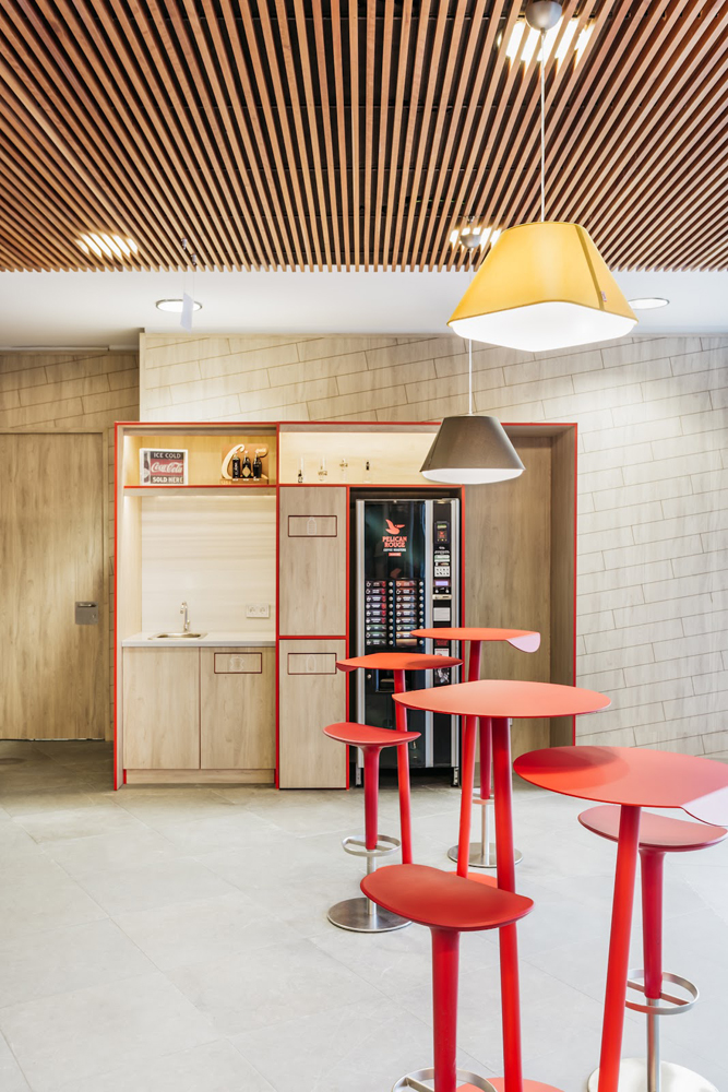
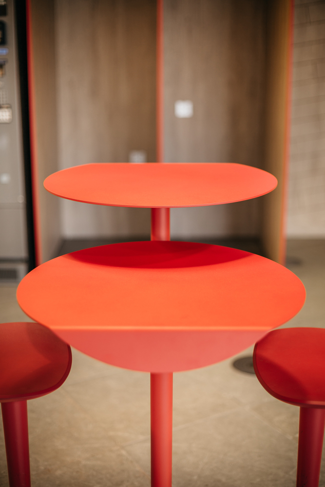
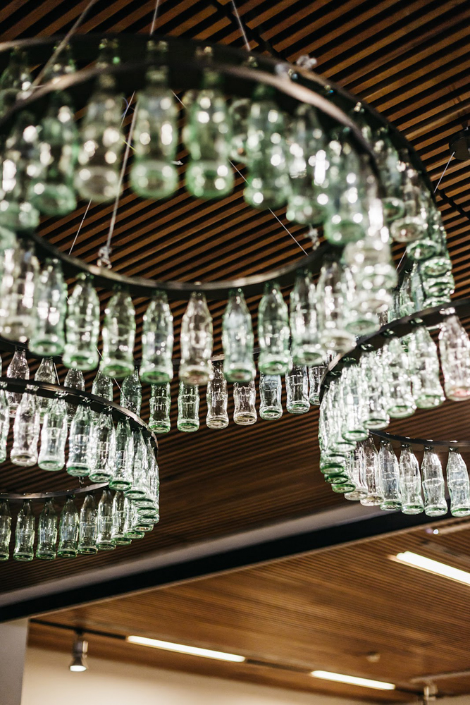
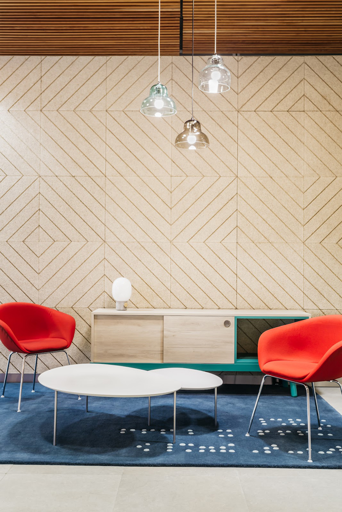
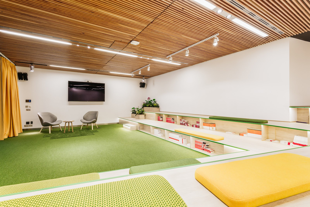
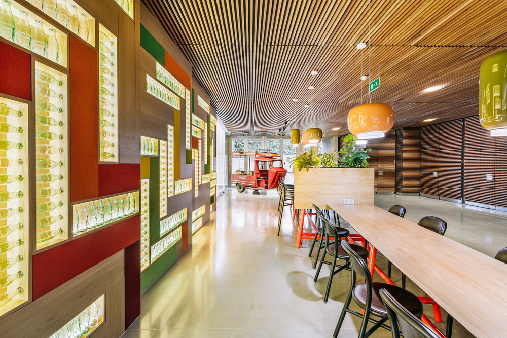
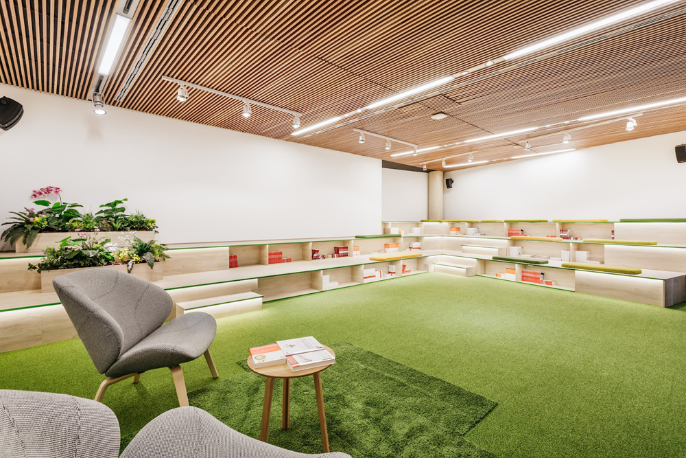
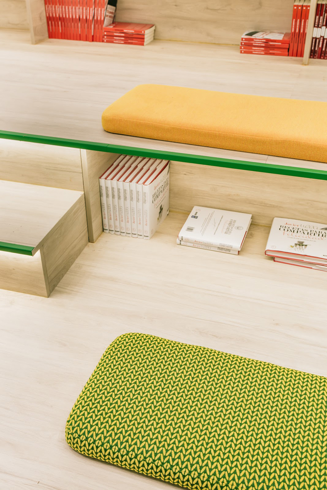
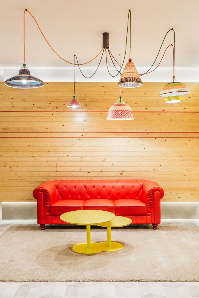
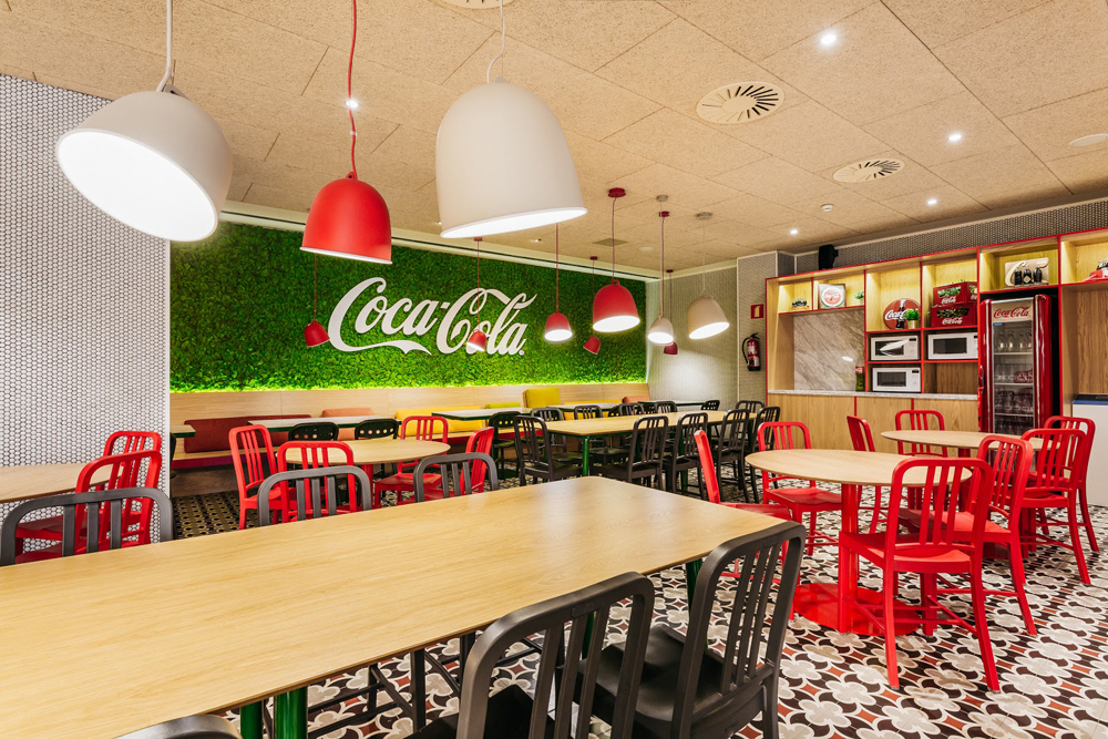
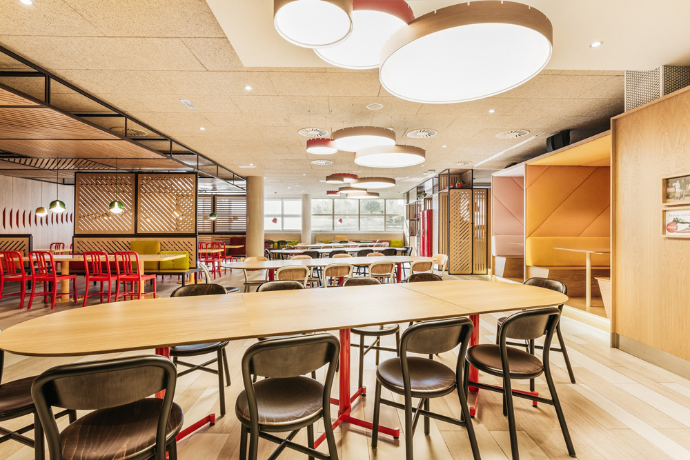
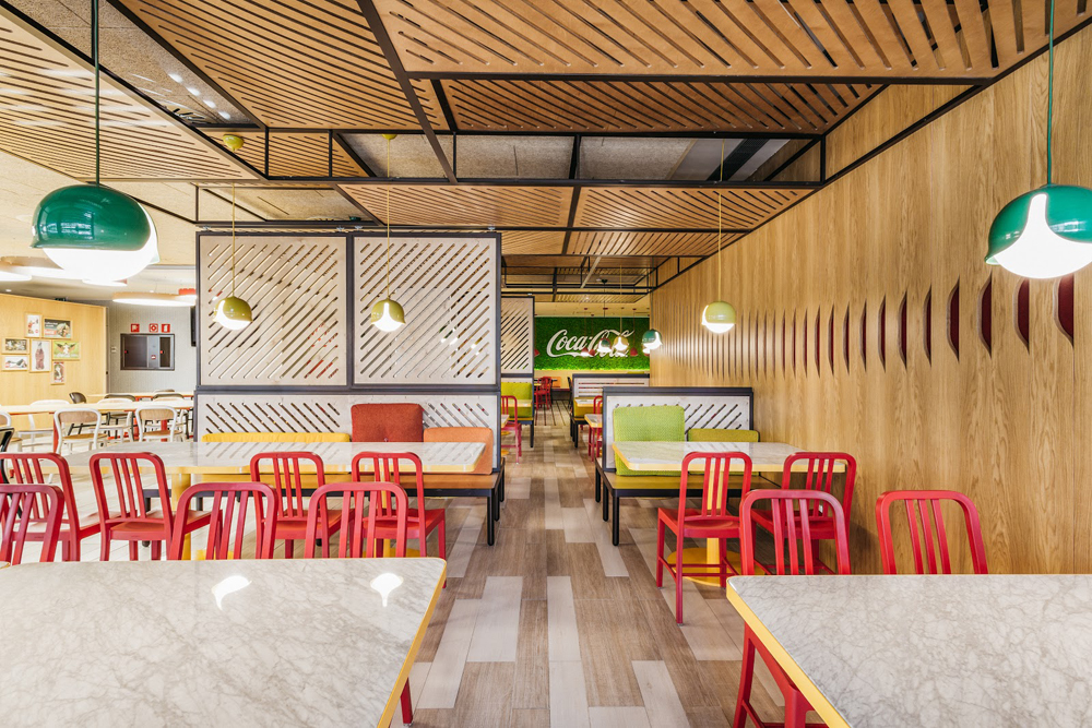
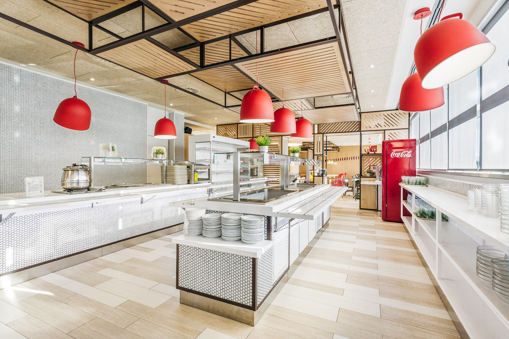
The spirit of the brand is reflected in a multitude of details that can be seen in the photographs that accompany this post and that make the work of Stone Designs a delight for the senses. The offices are full of custom-designed elements, such as the lamps in the lounge area in the entrance, created from bottles, or the metal tables in the meeting areas, inspired by the shape of a bottle cap after being opened. Also waiting to be discovered are different types of spaces that draw us in, inviting us to investigate every corner, among which are the huge frames that can be used as cosy meeting areas or the bookshelf staircase.
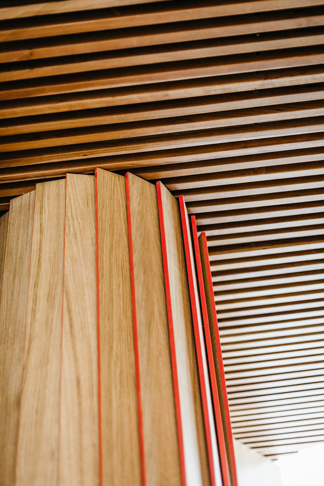
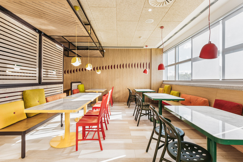
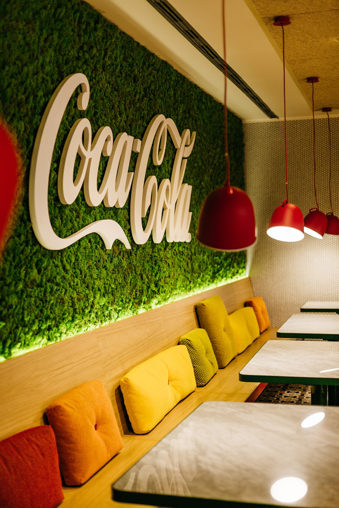
The materials used are something that has been very carefully thought about. Here Stone Designs' decision to opt for a natural wood veneer finish is important with Roble Rústico from FINSA's Gama Studio Natur, used for the wall panelling. The natural features of the oak, combined with the colours and textures of the upholstery and the Coca-Cola red details of the metallic elements, contributes to subtly embody the company's values.
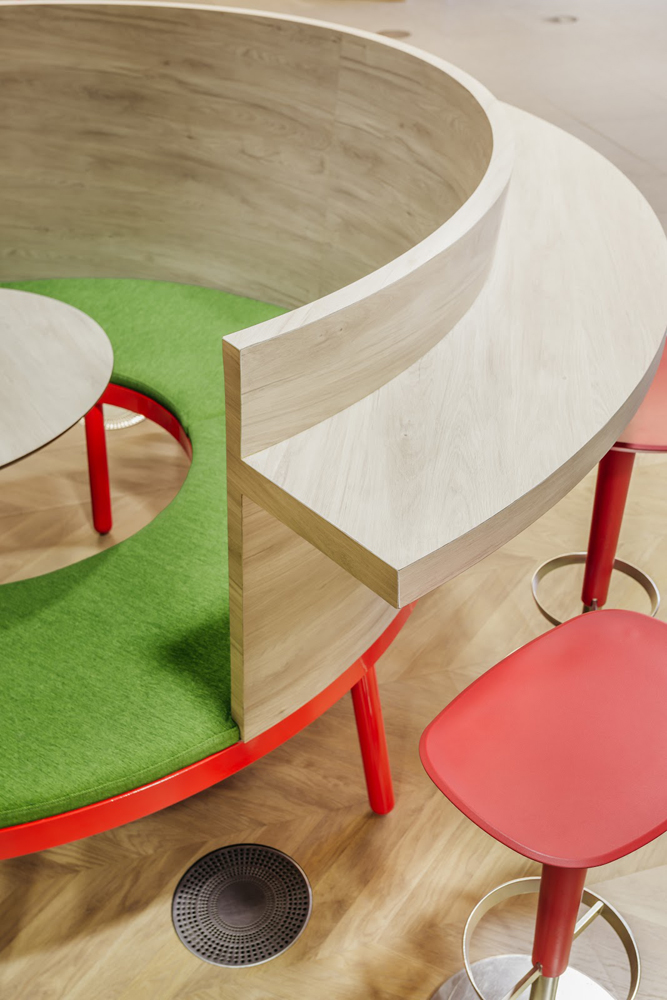
Easy maintenance and durability have led the studio to employ Fibraplast Flame Retardant a melamine finish, opting for Roble Aurora from our Gama DUO for the design of the furniture, such as in the bookshelf staircase or the original curved seat that is located in the reception area, which can be used by up to 5 people during a video conference. “We like working with Finsa. We feel confident with them, they meet our deadlines. We will continue to work with them on future projects”, says Stone Designs.
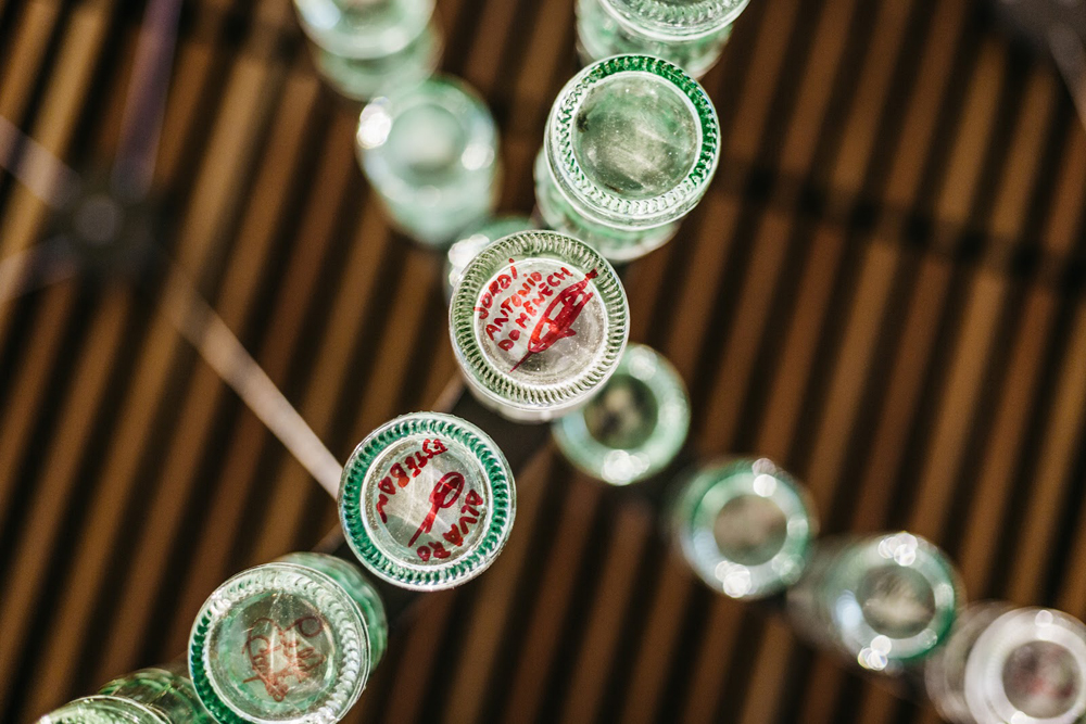
In the offices of a big brand like Coca-Cola, the integration of the brand is fundamental and Stone Designs has opted to do this in a different and original way, for example, incorporating a hand-painted logo on old doors, using a large logo on the ceiling of the cafeteria or by creating a wall with hundreds of bottles signed by employees.
A place to enjoy every moment, inspiring, inviting creation. But also cosy and welcoming, which favours communication. A Coca-Cola place.
If you liked this case study, tell us what you thought of it on Facebook, Instagram, LinkedIn or Twitter.
